








What Design Can’t Do

This project focuses on the redesign and typesetting of What Design Can’t Do by Silvio Lorusso. The goal was to give the publication a fresh, contemporary identity while staying true to the author’s original voice and themes.

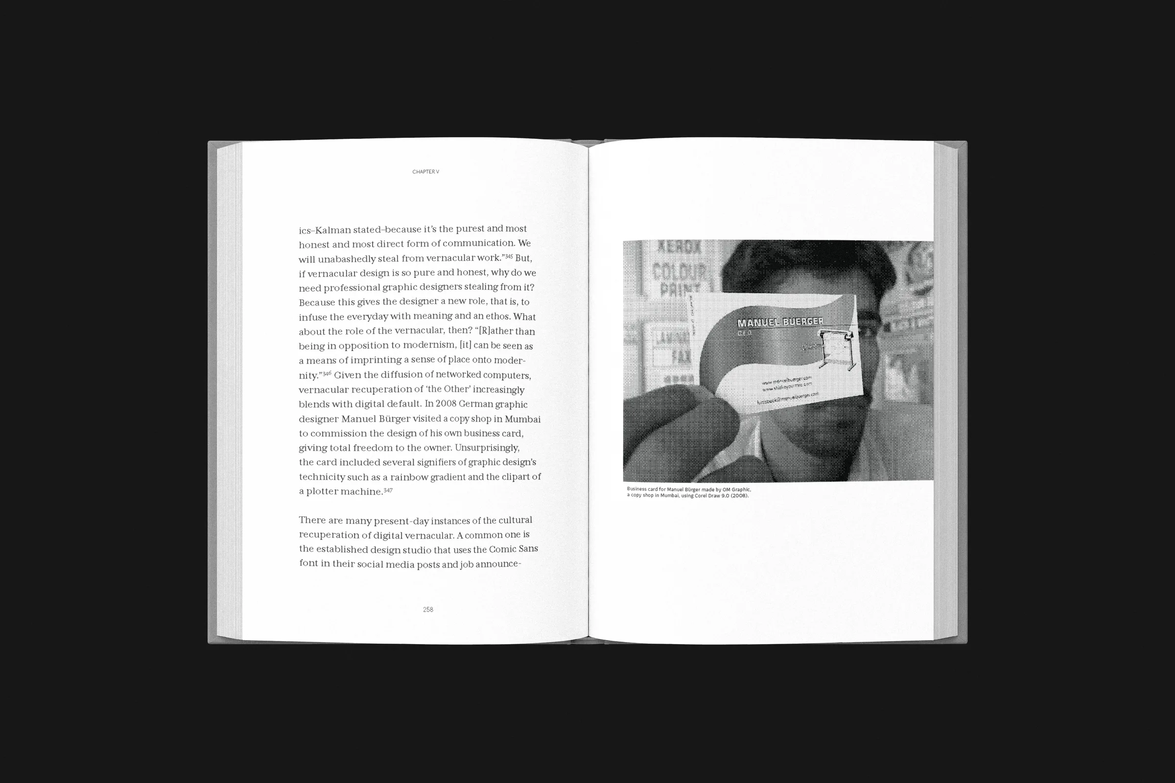
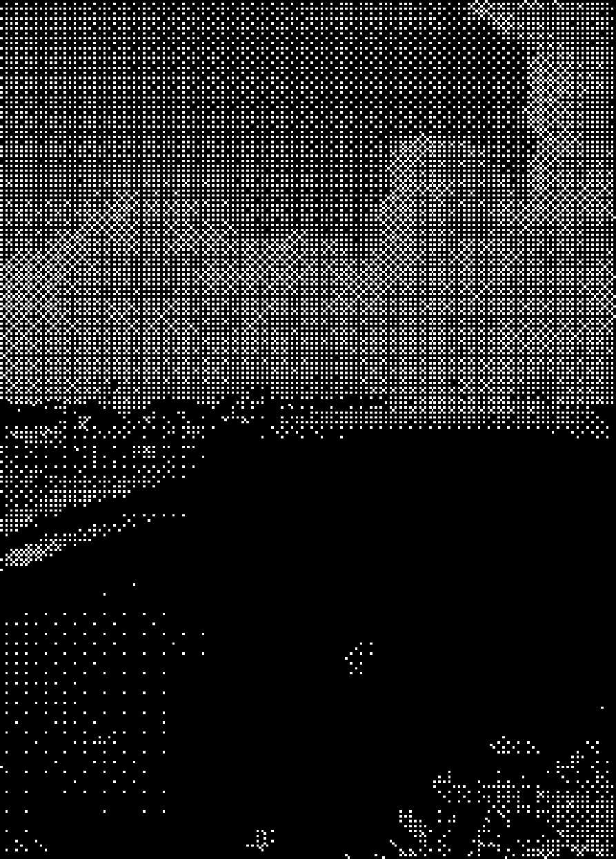
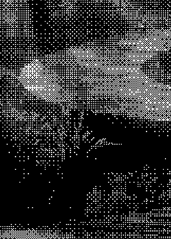
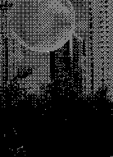
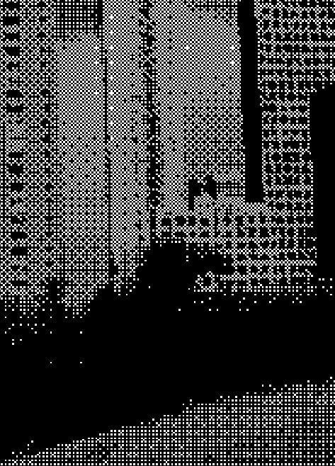
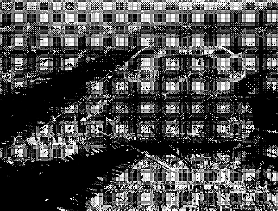
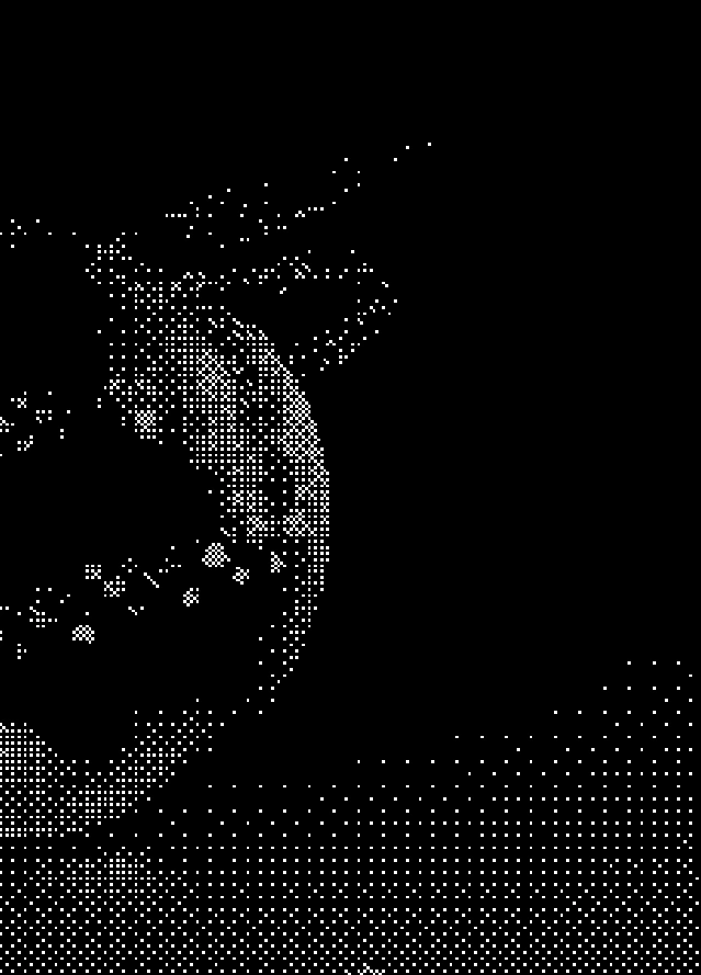
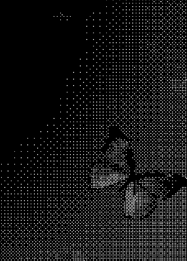
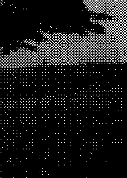
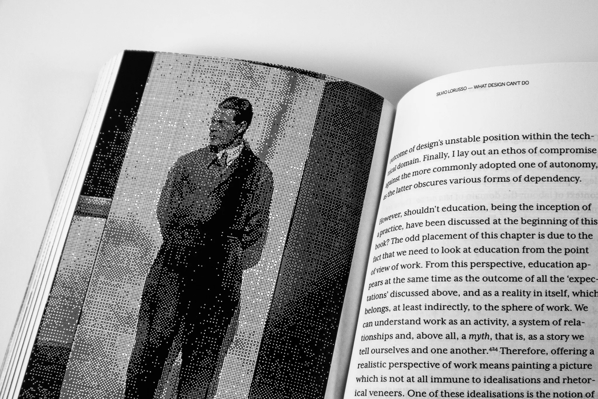
Drawing inspiration from the book’s exploration of internet culture, memes, and digital communication, I developed a visual language centered around bitmap imagery. This approach was carried throughout the publication, from the cover and chapter openings to imagery within the interior pages.

By using bitmap graphics as a consistent design element, I created a cohesive visual identity that reflects the book’s relationship with digital culture. The result is a contemporary, engaging publication that reinforces the original content without overshadowing it.

The book standing upright on a white surface, its cover a woven bitmap pattern with the title What Design Can’t Do and the author name Silvio Lorusso
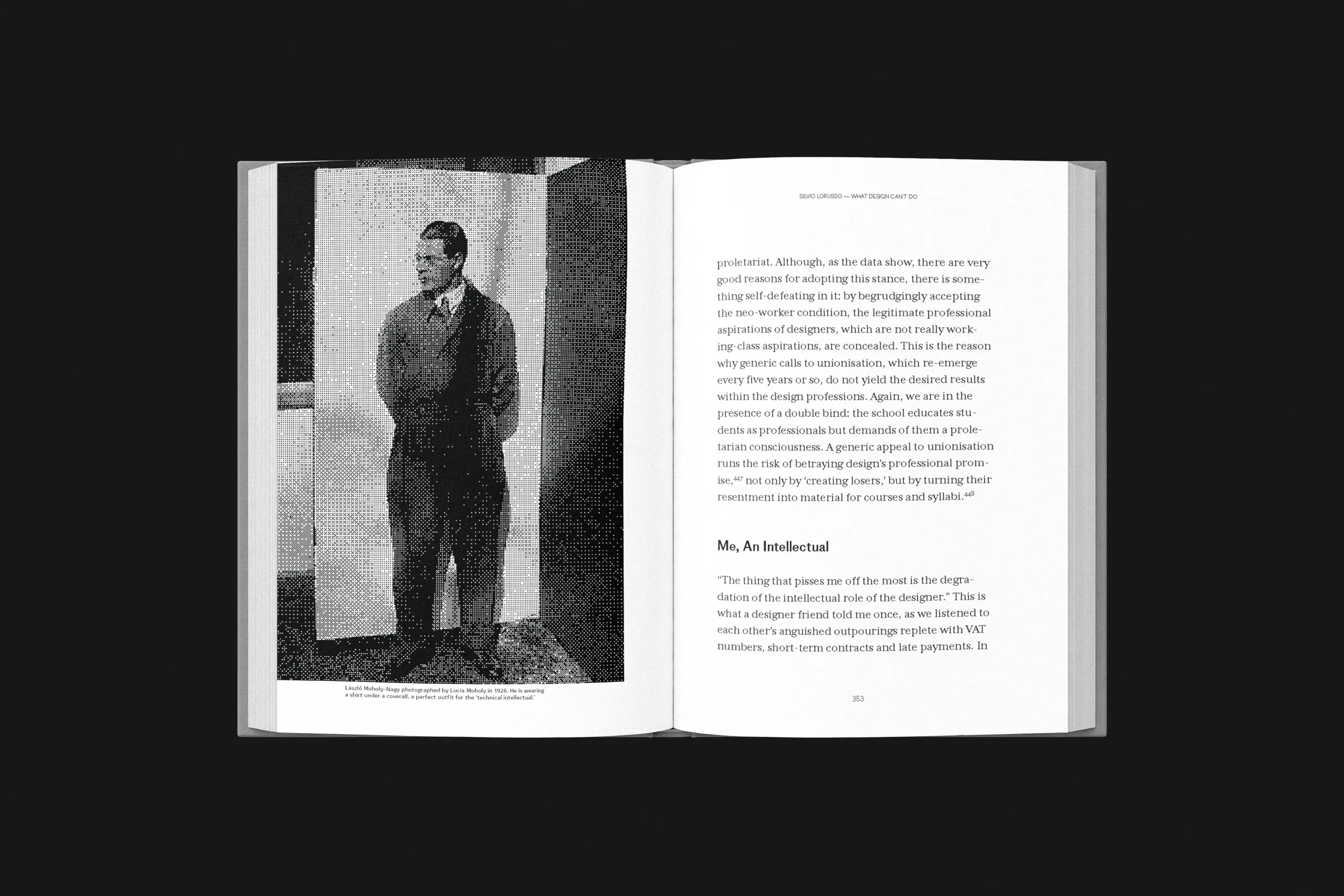
An open spread with a grainy black-and-white portrait of a man standing against a wall, beside a page of text
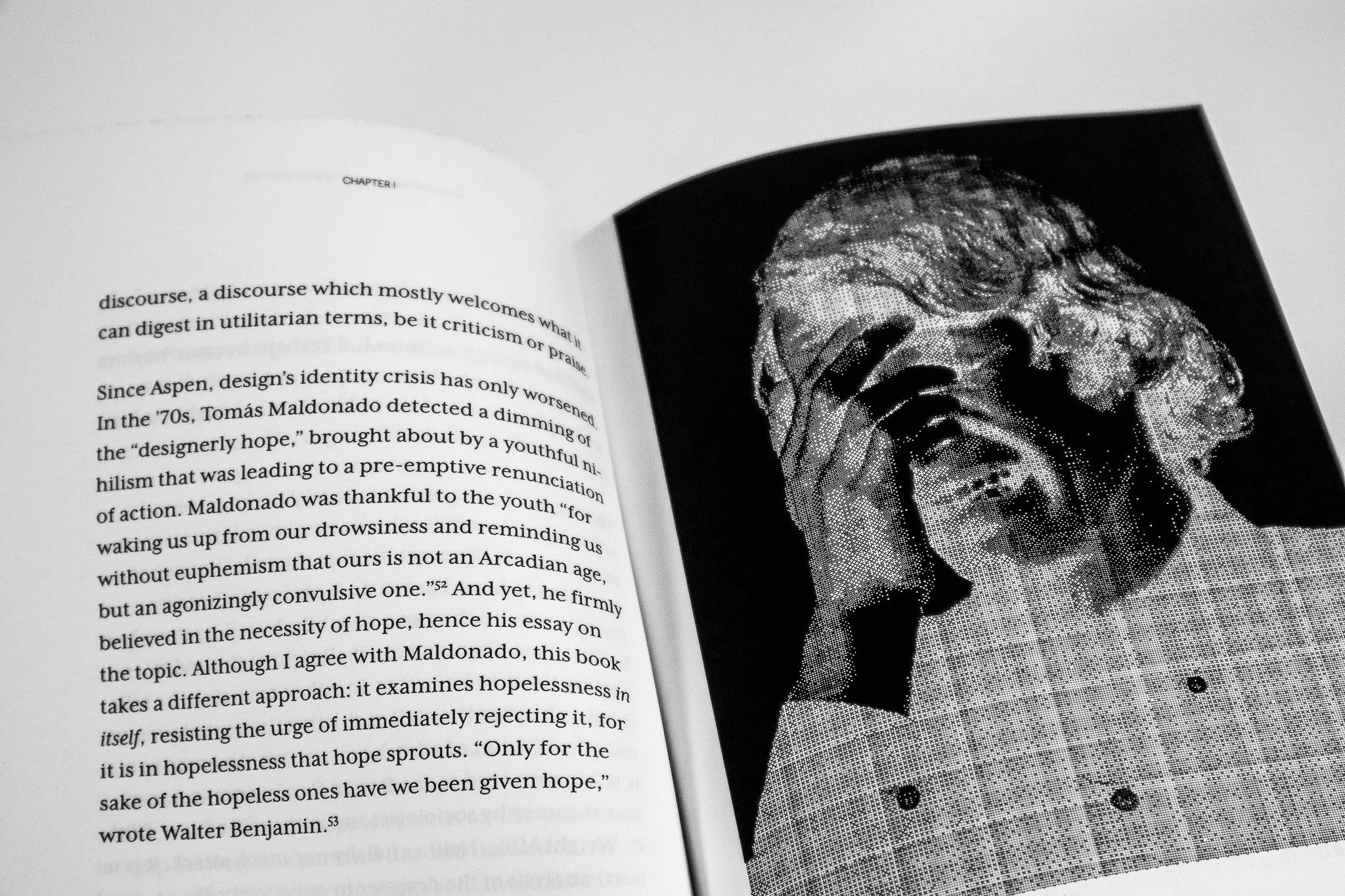
An open spread with a page of text beside a bitmap photograph of a statue with a hand over its face
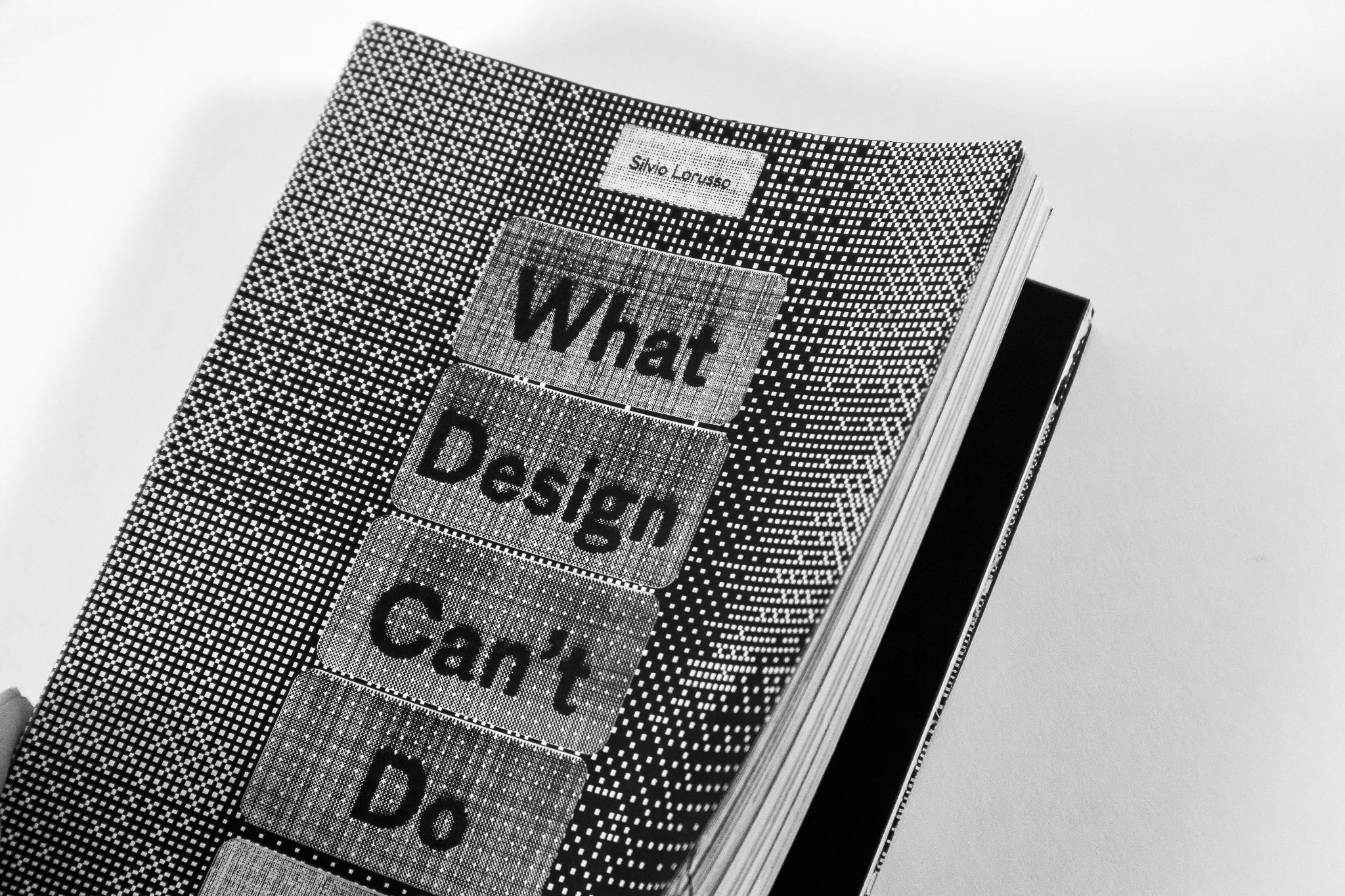
Close-up, at an angle, of the book cover with the stacked title What Design Can’t Do in a bitmap texture
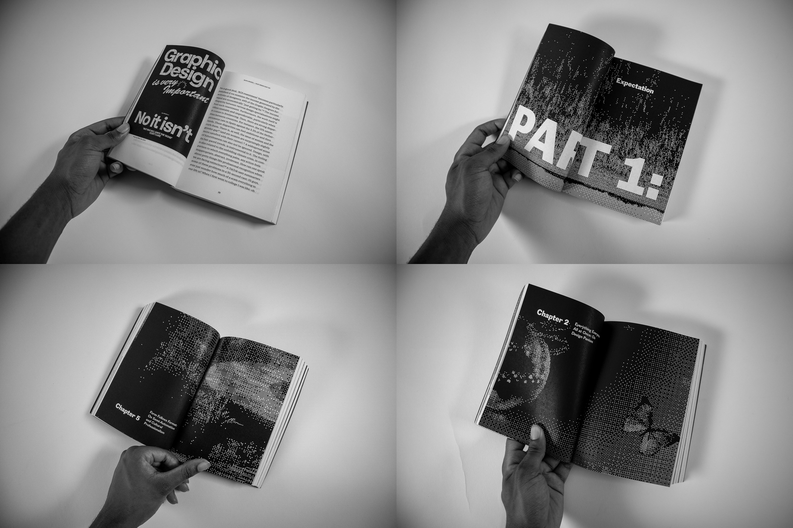
A hand holding the open book to a page headed Graphic Design is very important, answered by No it isn’t
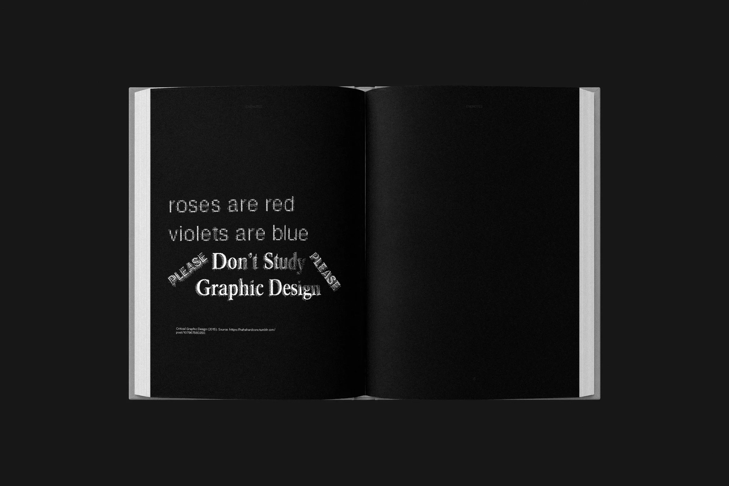
Dark spread with the lines roses are red, violets are blue, why don’t you study graphic design
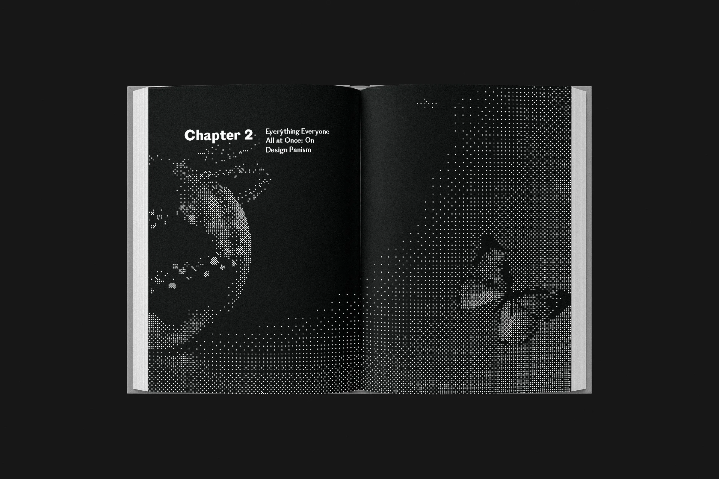
Dark spread of the Chapter 3 opener with a bitmap sphere and butterfly
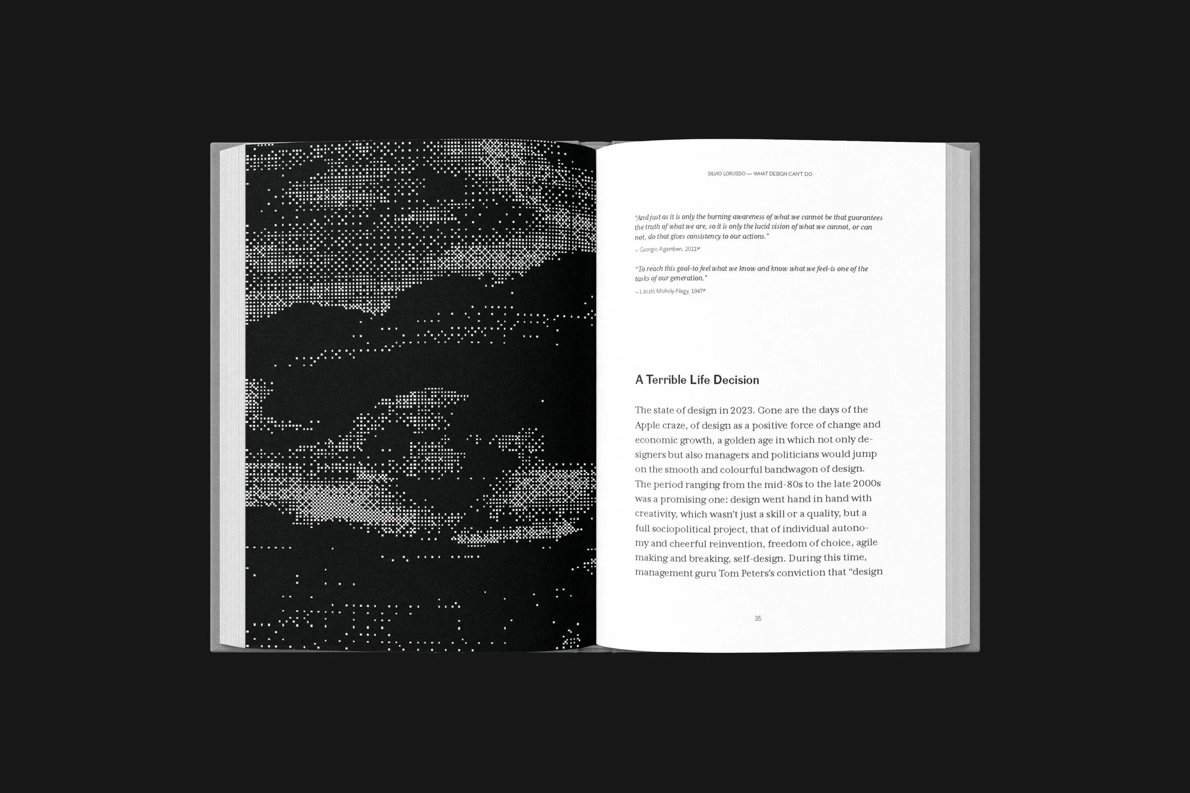
Dark spread with a full-page bitmap landscape beside a page of text
Dark spread with a text page and a small inset photograph
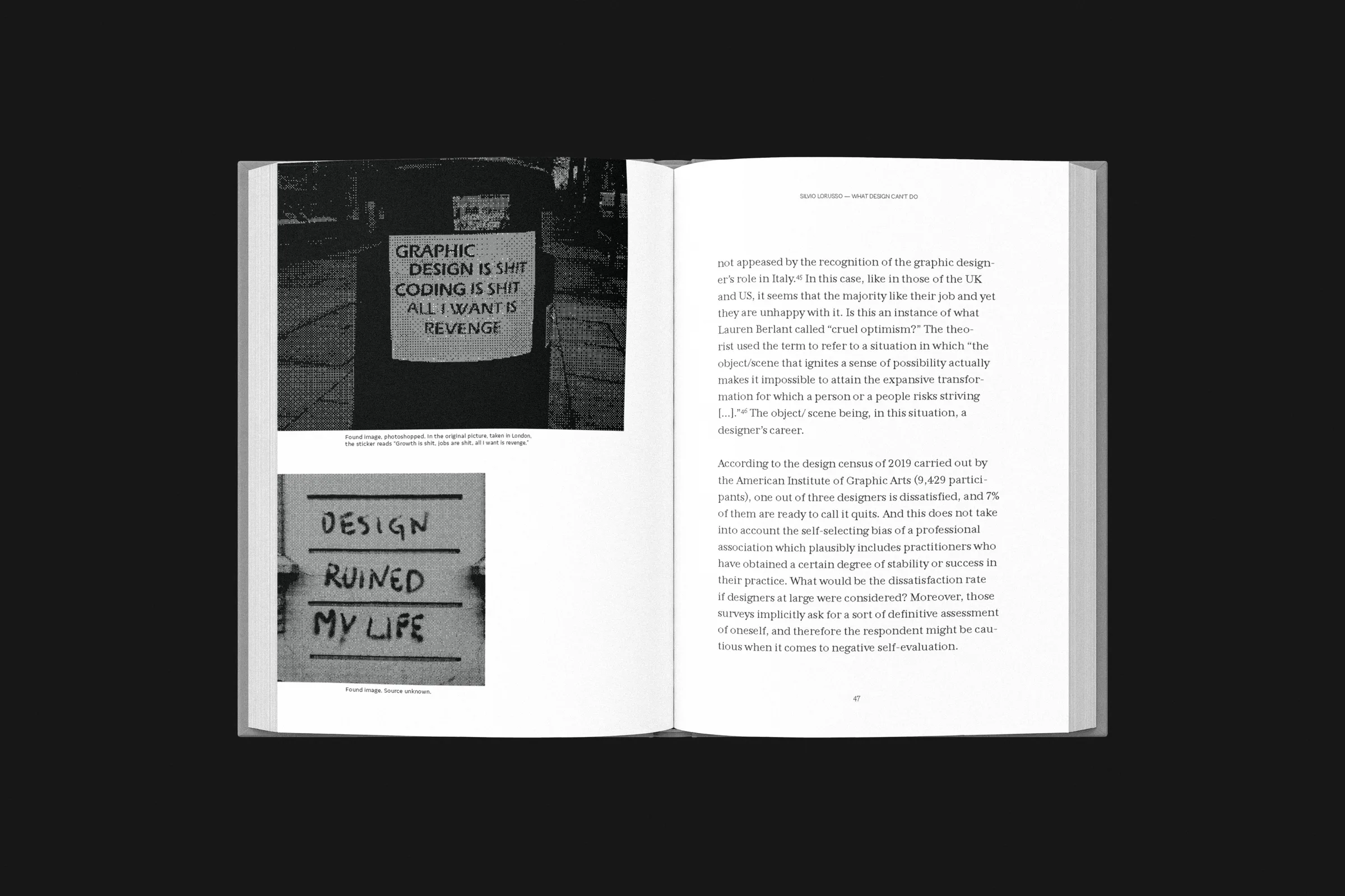
Dark spread with a photographed sign reading design saved my life beside a text page
Dark spread with a bitmap portrait of a standing man beside a text page
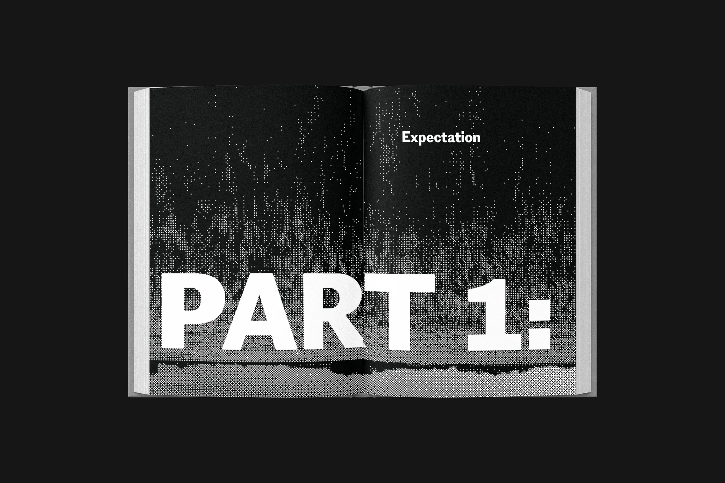
A wide open spread with a bitmap landscape and the chapter opener Part 1: Expectation in large white type
All work
Loading website